Dead Drawn Daily
Website development
When I first moved to Los Angeles, I joined the local natural history museum as a member, thinking it would be a fun and cost-efficient way to level up my drawing skills. I committed to drawing visits daily (well, mostly) for several months, stopping when I inevitably got a job and had somewhere else to be during museum operating hours.
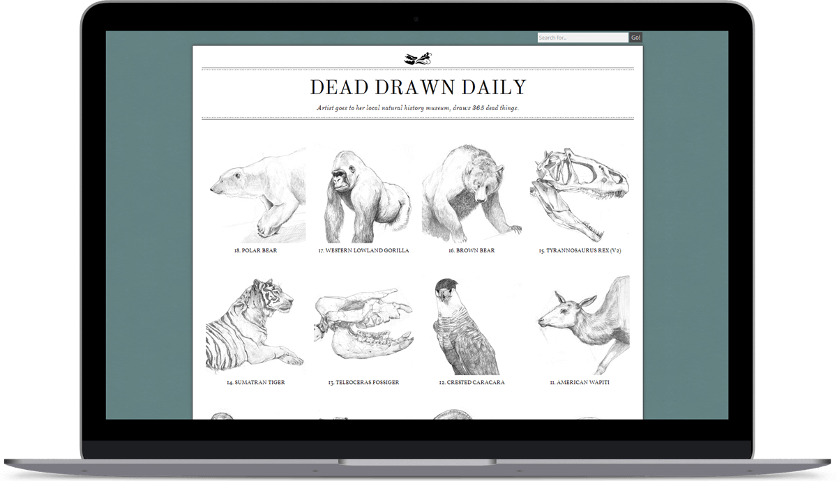
I developed this website with Wordpress CMS to showcase what I think are the more aesthetically pleasing drawings in the series, and am in the process of optimizing the site code.
Design Process
I always start my designs by brainstorming with pencil and paper. In this case, the design was fairly straightforward: I knew from the start that I wanted a grid-layout portfolio, and I wanted to take visual cues from the realm of scientific and natural history illustration.
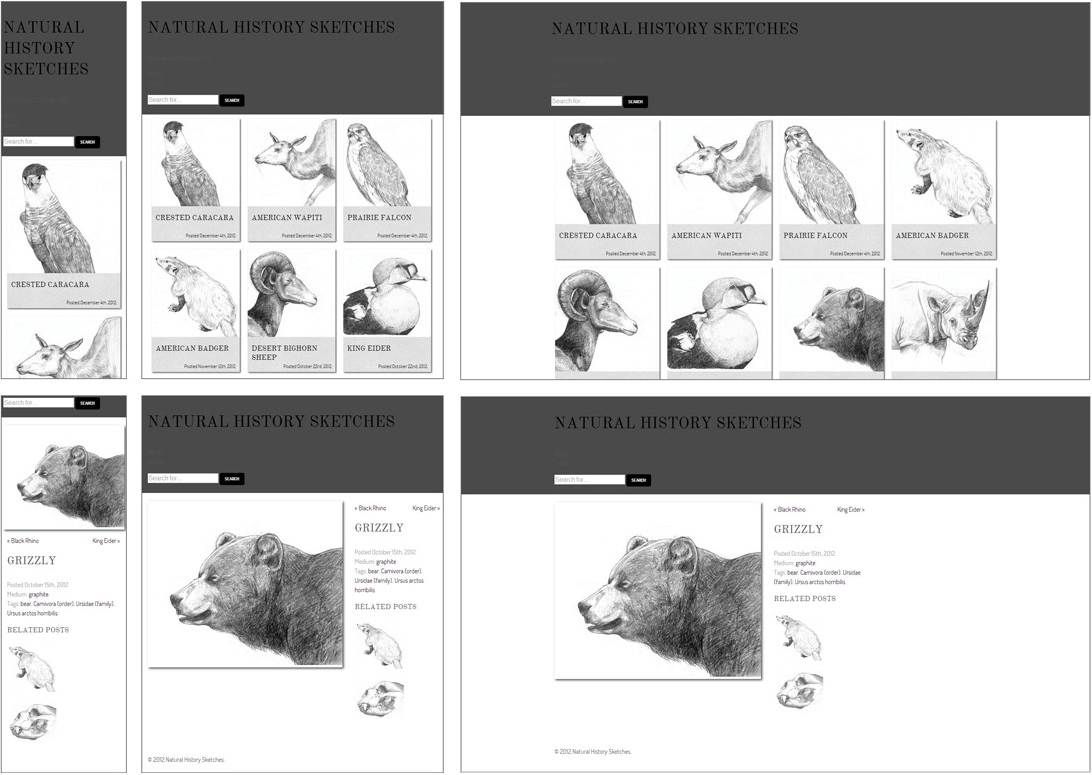
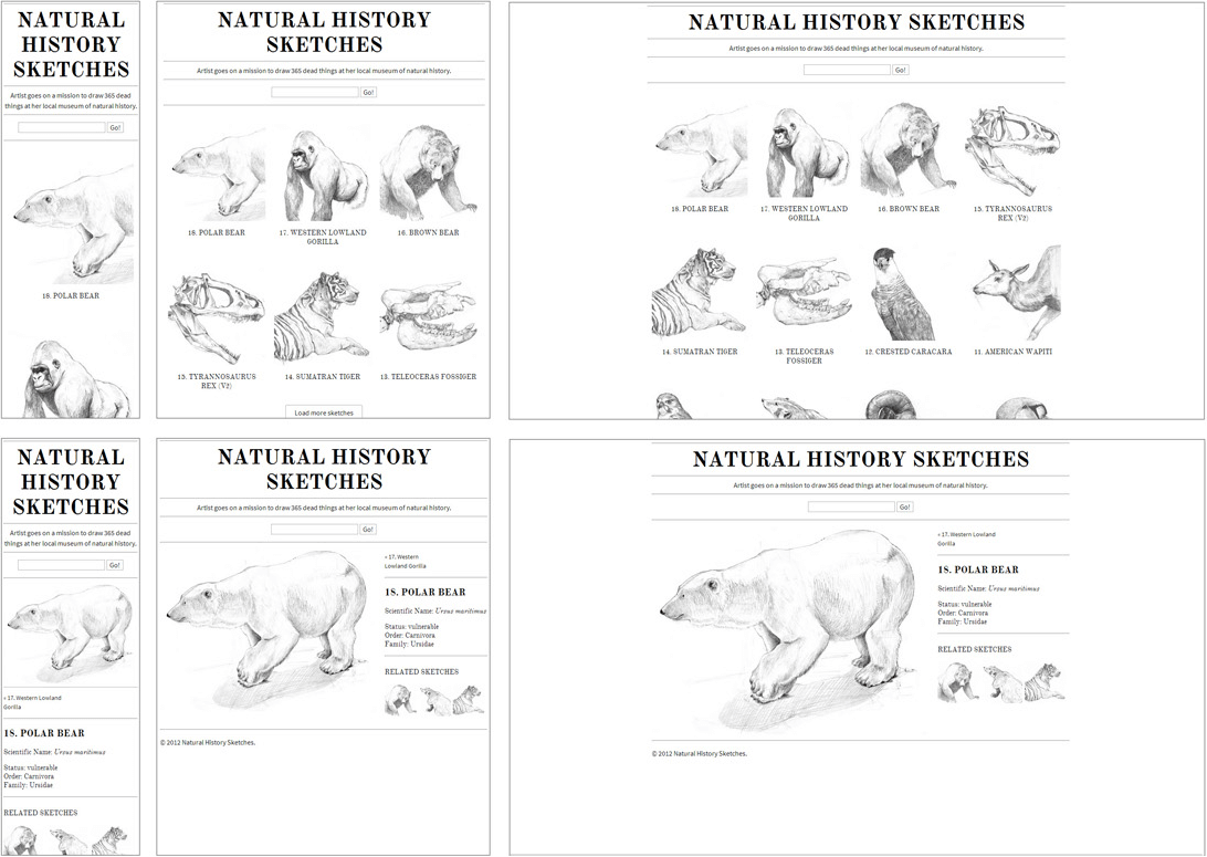
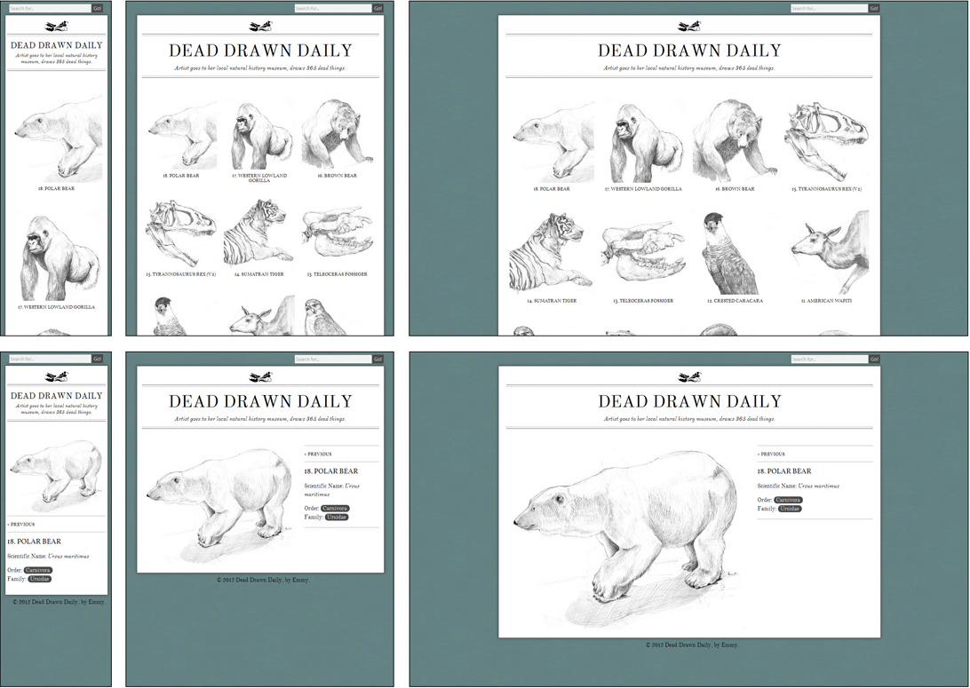
Once I had nailed down the layout, I jumped directly to prototyping in-browser. The following screenshots show the responsive planning process for the index page and the individual post page.
Physical Artifacts
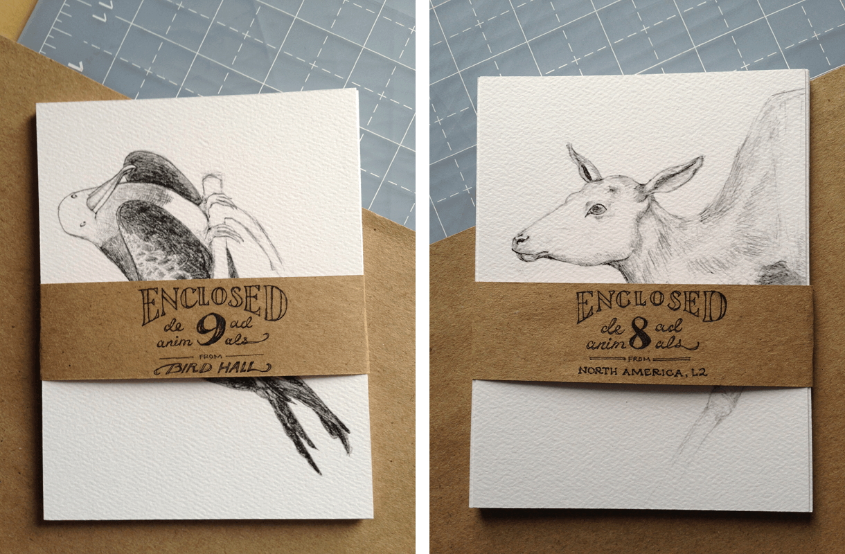
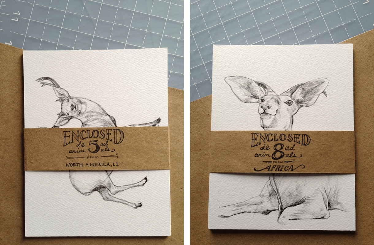
I also printed a limited run of the drawings, formatted as postcards, to commemorate the series:
