Aeon at The Huntington
Website Development
Overview
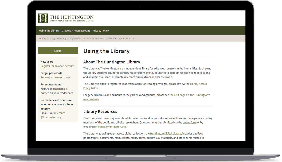
The Huntington Library is an independent library and research institution in San Marino, California. Aeon, a software product by Atlas Systems, is the digital entry point for anyone wishing to access The Huntington Library's closed stacks archives. Aeon is used by applicants to request on-site Library access, by members of the public to order digital images, and by approved researchers to order materials for on-site viewing.
I was brought on to evaluate and update Aeon's patron-facing web interface: its initial implementation in 2014 closely followed the vendor's out-of-the-box web template, but several years on, limitations of the template had become evident. Ultimately, we did a full redesign of the website.
I was the developer for this project, with my department head Anne Blecksmith supervising. Warm thanks go to the Reader Services department for their support, particularly Sara Couch and Stephanie Arias, and to the team at Atlas Systems, particularly Chris Youngblood.
Objectives
These were some major limitations to the existing website, so we identified the following priorities for the redesign:
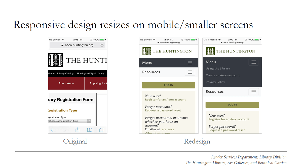
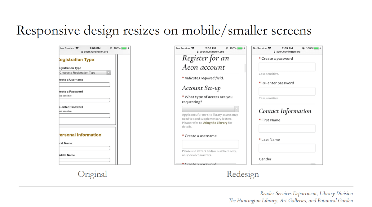
- Functionality: The existing website was unable to adapt to smaller devices and screen sizes, so a responsive layout was paramount. Another usability issue was the form design: users frequently expressed frustration with unforgiving form fields.
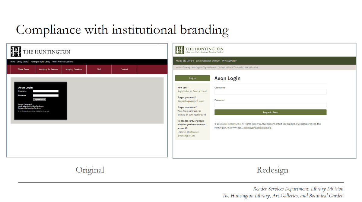
- Branding Compliance: The website's visual design needed to be updated for compliance with the larger Huntington institution's digital branding guidelines, updated in 2017.
- Maintenance Ease: Dependencies for account permissions combined with sporadic edits over time caused inconsistencies to proliferate across page sets. Consequently, we needed to restructure the HTML to facilitate updates and reduce duplication.
Assessment
Prior to redesign, we sought to identify the most common issues and questions that users experienced, both on and off the website. Over a six-month interval from July–December 2016, the Library received a total of 2,002 queries via phone, email, and in-person visits. This information was logged by staff into LibAnswers, a software product by Springshare.
There was another layer of complexity in the form of The Huntington's institutional website, which also contained information about using the Library. Our first step was to review, categorize, and exclude the queries which we felt distracted from the Aeon website's focus and which would be better addressed via The Huntington's institutional website.
Out of the remaining queries, we then identified 949 (or roughly 47% of the total) which we believed the Aeon website could better clarify, including:
- 74 queries about ordering digital images, with another 100 queries about in-progress orders
- 65 queries about ordering materials for on-site viewing
- 105 queries about the Library's access policy
- 55 queries about how to use the website
- 69 queries about scheduling a first-time appointment, and 65 queries about scheduling a return appointment
Redesign Process
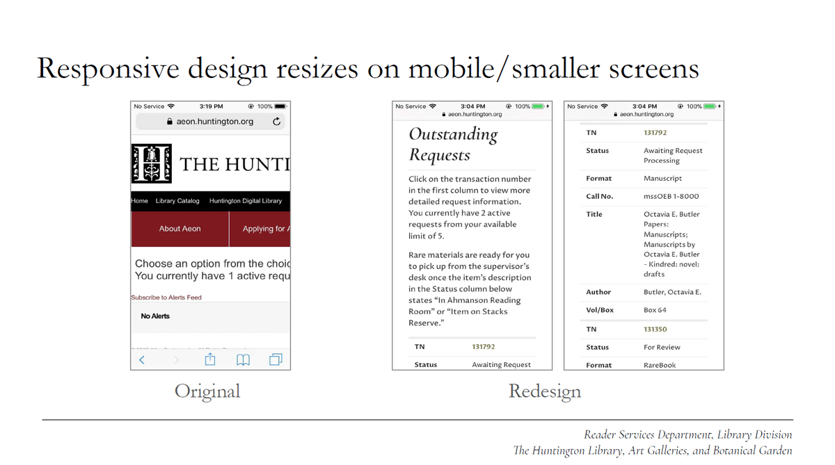
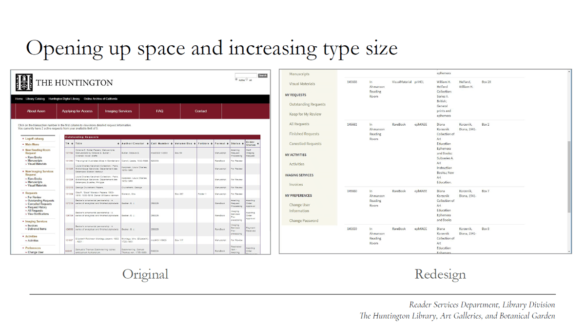
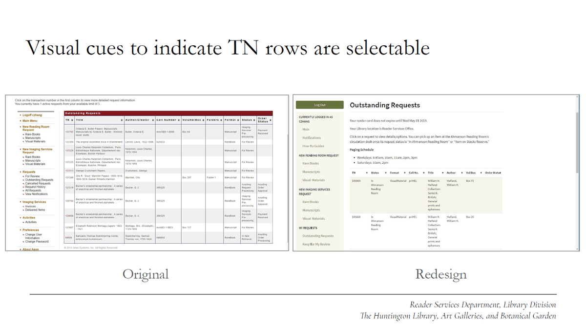
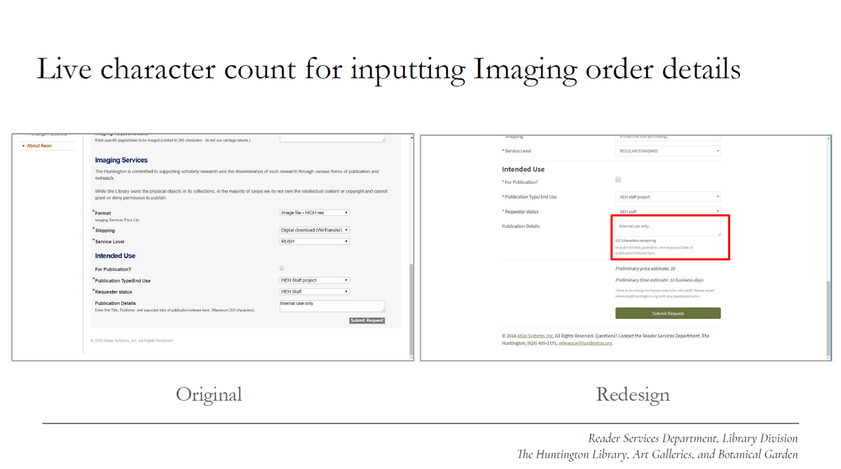
The following before-and-after deck slides were presented at the 2018 Aeon Symposium at Claremont and demonstrate some of the major changes made to the interface.


Solution and Results
These are the solutions we developed to meet the redesign objectives:
Functionality
- Responsive layout for functionality on smaller devices
- Typographic hierarchy and larger size for decreased visual strain
- JavaScript helper functions for improved form usability
- Important text in page content rather than buried in multipage PDFs
Branding Compliance
- Typeface, color scheme, and banner all updated and approved by Communications division
Maintenance Ease
- Use of Bootstrap, also used in other library software products, to set a consistent HTML structure and facilitate future updates
- Reliance on Aeon's custom include tags to reduce duplication
- Creation of internal documentation and checklists for reference
The redesigned website launched in the fall of 2018, and was generally well-received by researchers and by staff, though a follow-up survey will yield more exact feedback. Conducting another analysis of website-related queries post-redesign will also be a useful next step in assessing the redesigned website's effectiveness and in establishing a regular maintenance and update schedule.